Portfolio Case Study
Cathedral Concert Series Micro Site
Context
San Francisco’s Cathedral of St. Mary of the Assumption’s music program lacked a reliable web presence for its weekly concerts.
My Role
Designed and wrote a lightweight Carrd site to serve as a stopgap solution.
What to Notice
Before and after content strategy — solving usability, hierarchy, and voice gaps with a fast, maintainable micro-site.
At A Glance…

Project Type
UX Content Design – Stopgap Website

Format
1-page Carrd site
(low-maintenance design)

Skills Shown
Content design · Voice & tone · UX evaluation · Rapid problem solving

Deliverables
1-page Carrd site · Branded banner · Navigation · Integrations
Reflection
Created as a low-cost bridge when staff couldn’t prioritize concert promotion, this microsite connected the program with modern tools and consistent messaging.
Those foundations later supported the pandemic pivot to online delivery, helping the Cathedral maintain continuity and comfort its community while reaching new international audiences.
The microsite remained in use for about four years, until the Cathedral’s redesigned website shifted program needs and workflows.
Problem
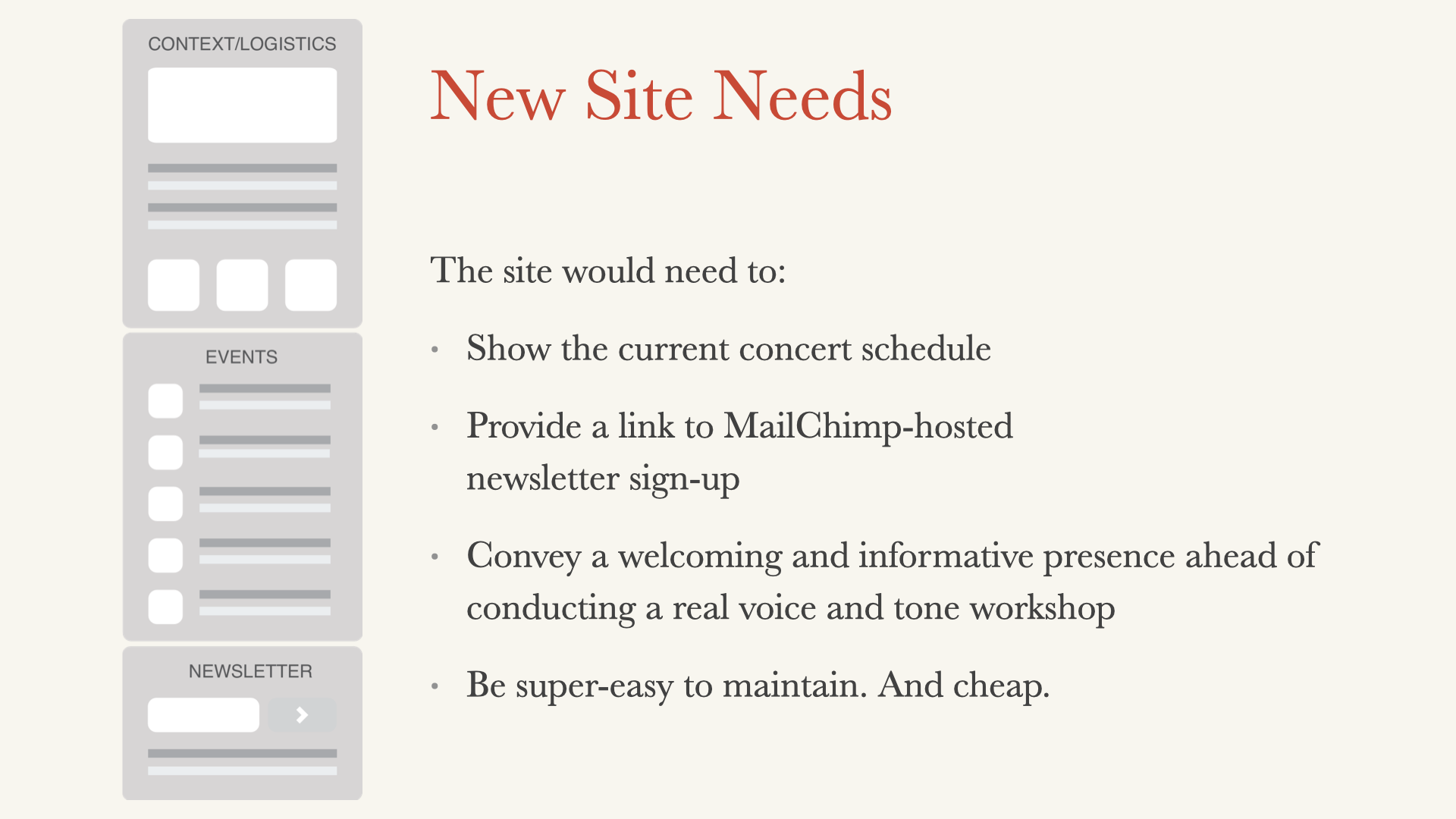
The Cathedral’s website had last been refreshed in 2010. It was not responsive and had walls of text, minimal IA, no typographic hierarchy, and undefined voice & tone.
Concert information was often delayed or incomplete because updating was a low-priority, add-on staff task.
As a result, audiences couldn’t rely on the website to know what concerts were happening.
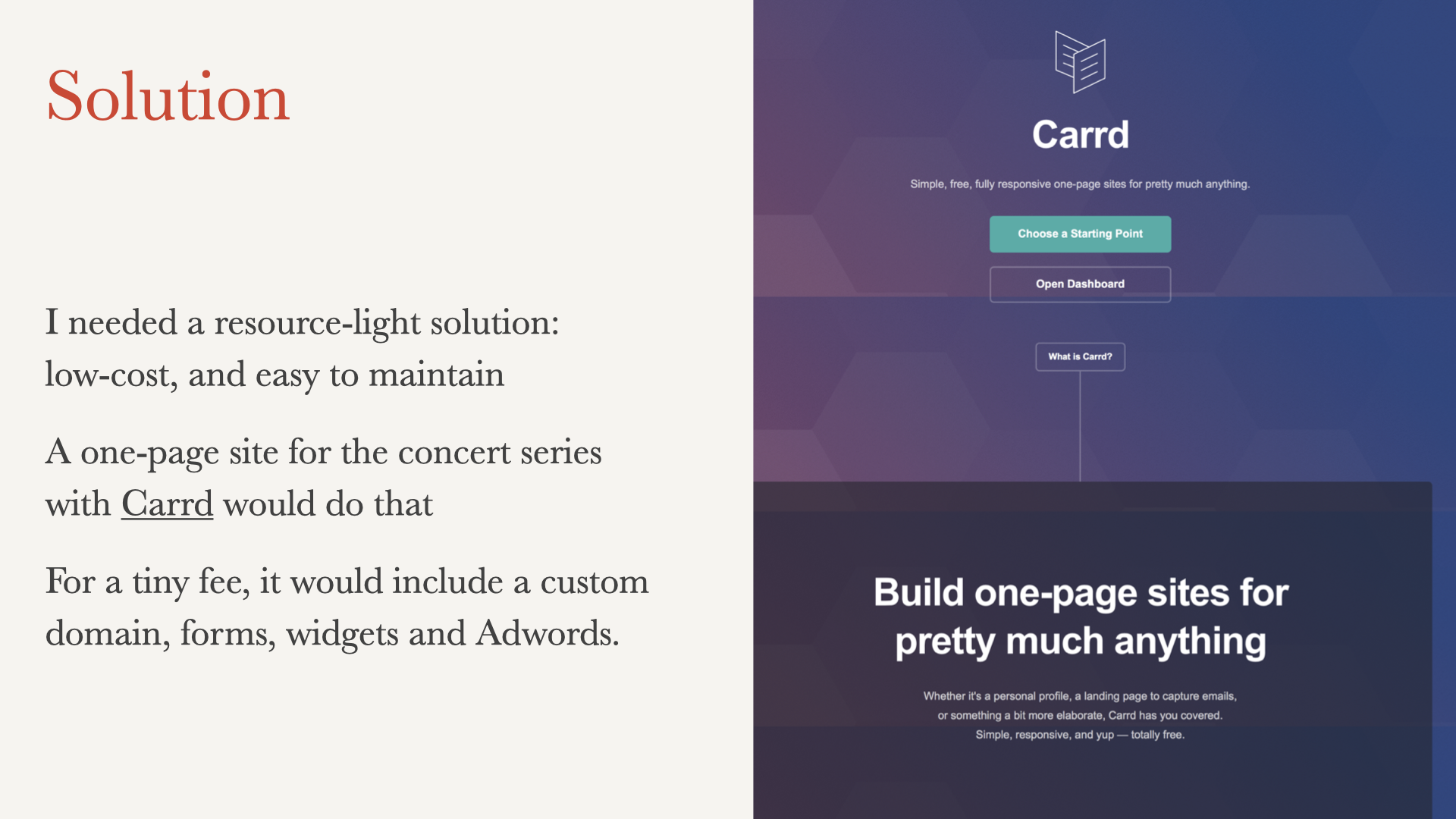
Solution
A lightweight, one-page site that restored trust and continuity for the Cathedral’s concert program.
Designed a one-page Carrd site as a stopgap — lightweight, inexpensive, easy to update.
Expanded during the pandemic to support new online concerts, helping the Cathedral maintain continuity and expand audience reach
Features
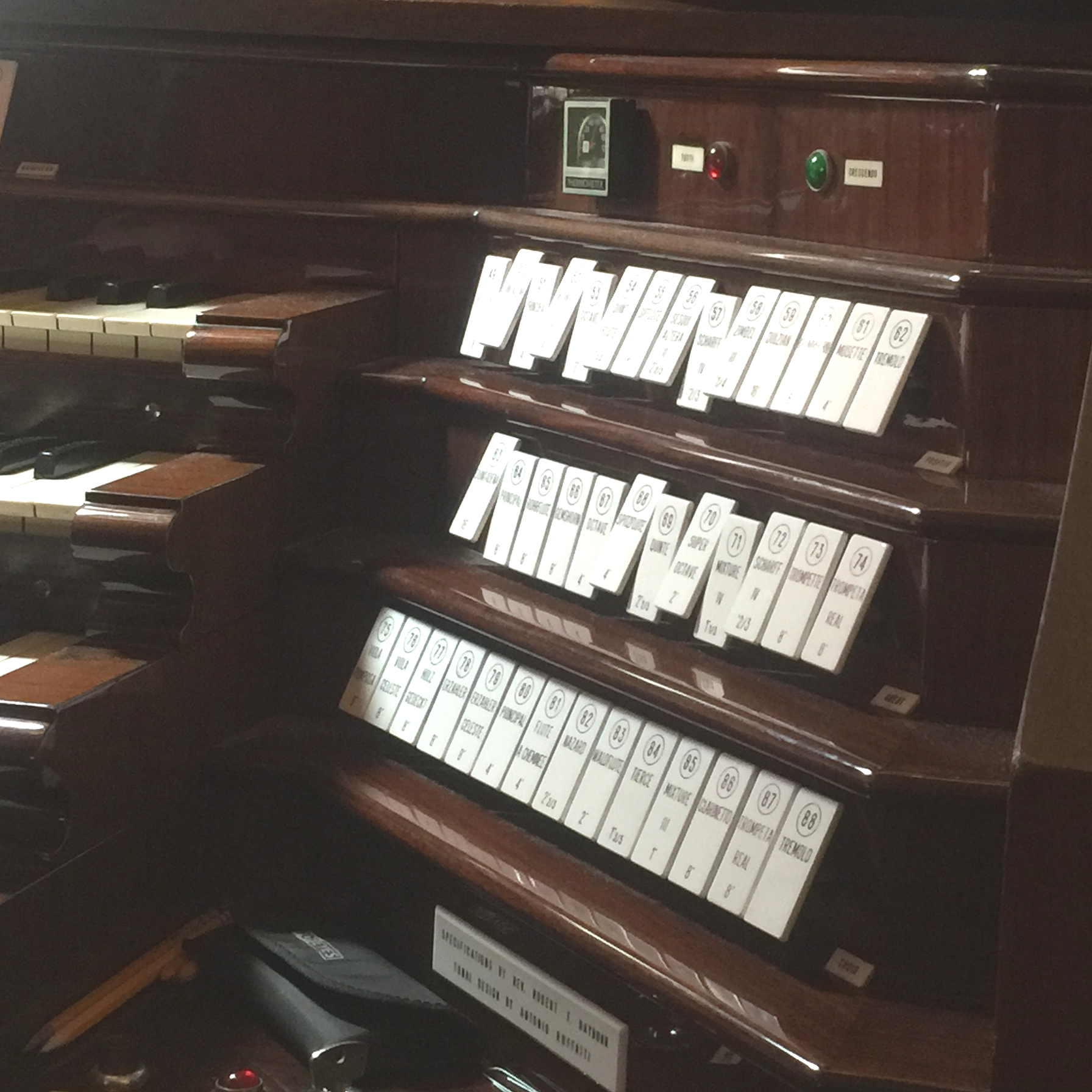
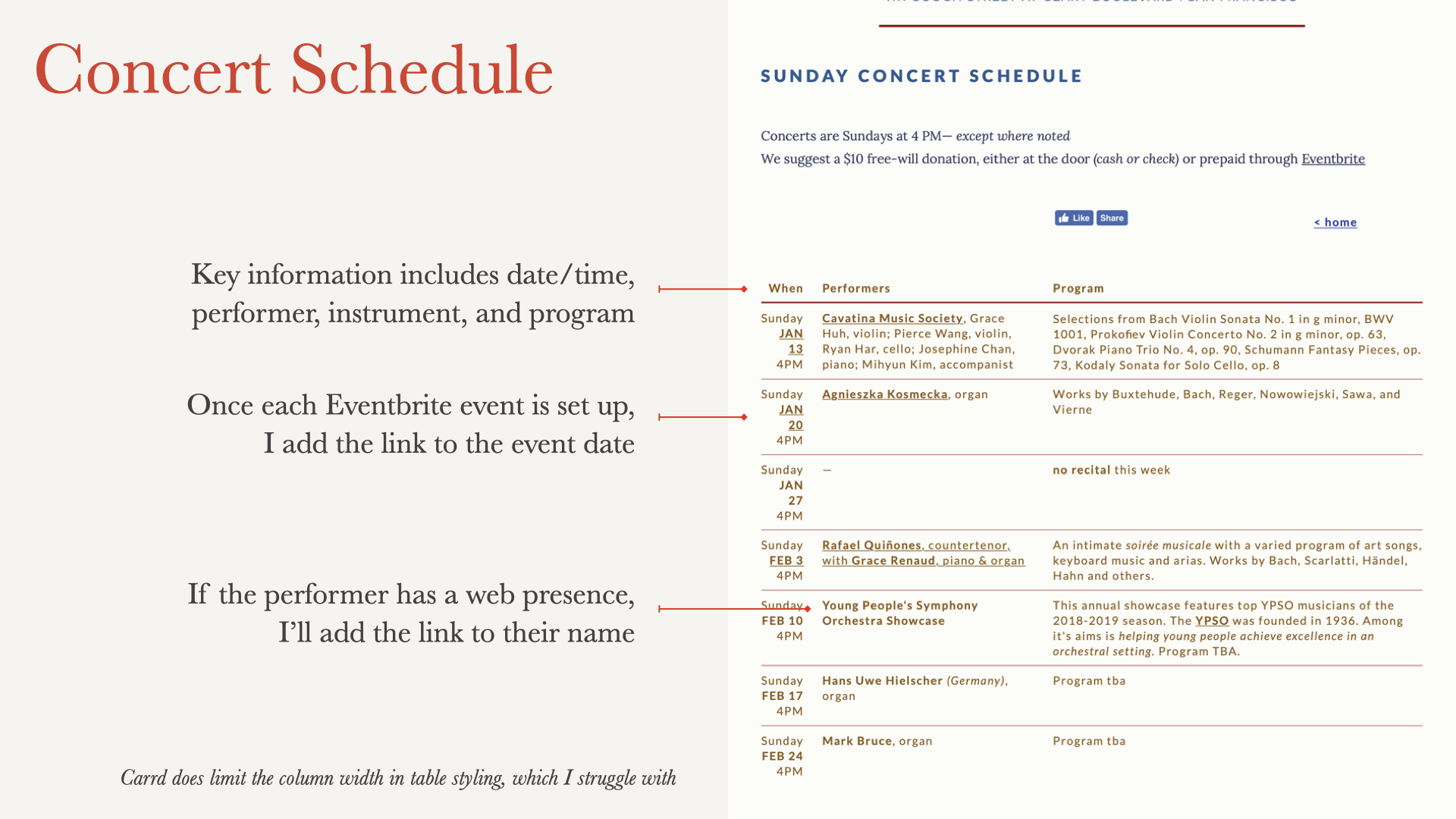
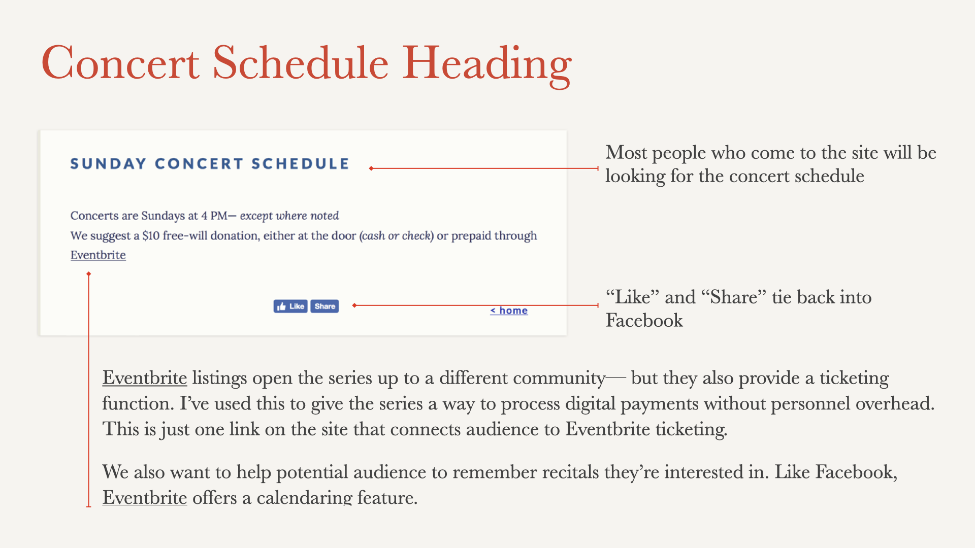
• Concert schedule with date, performer, and program
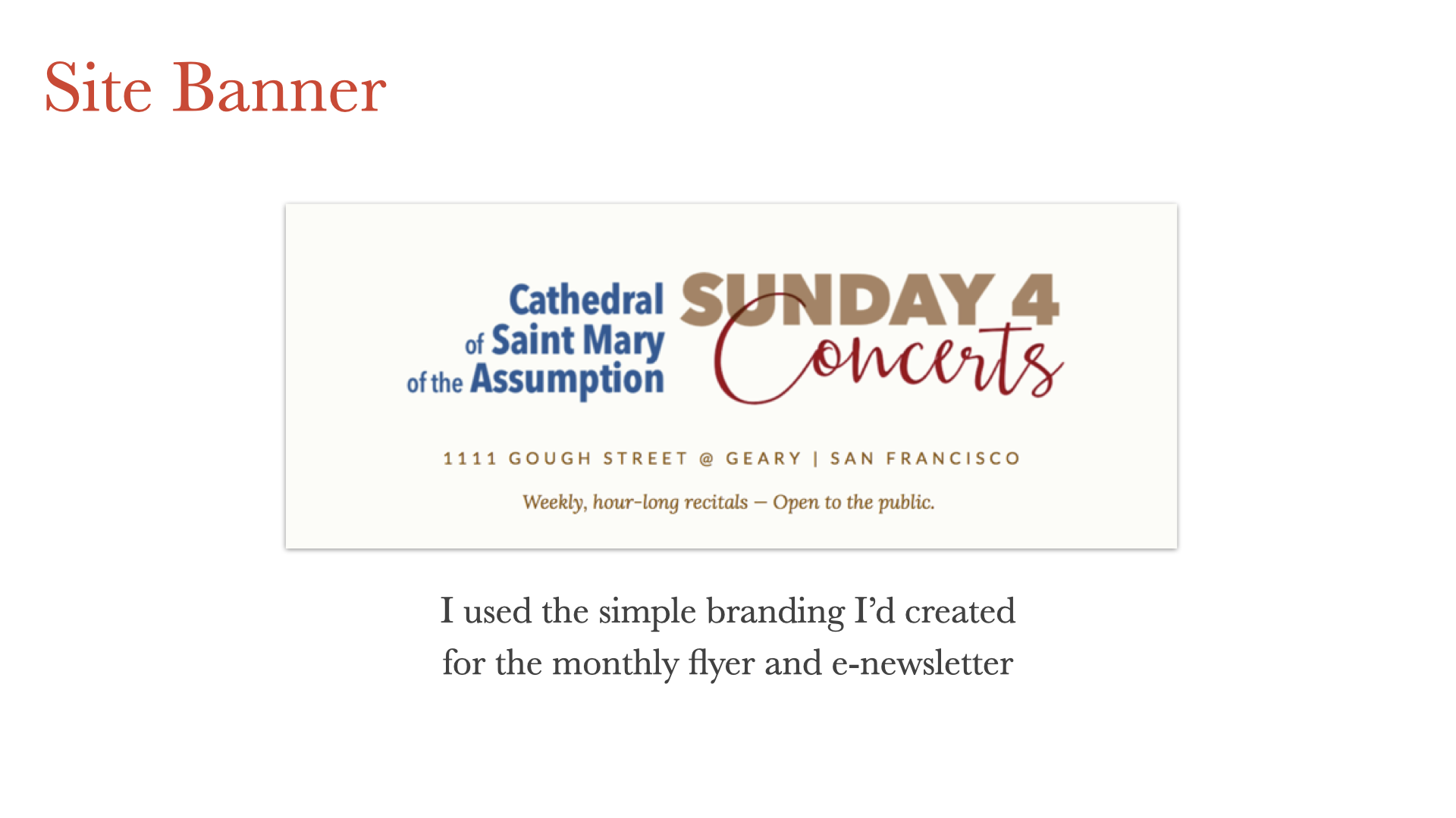
• Branded banner aligned with flyers and newsletters.
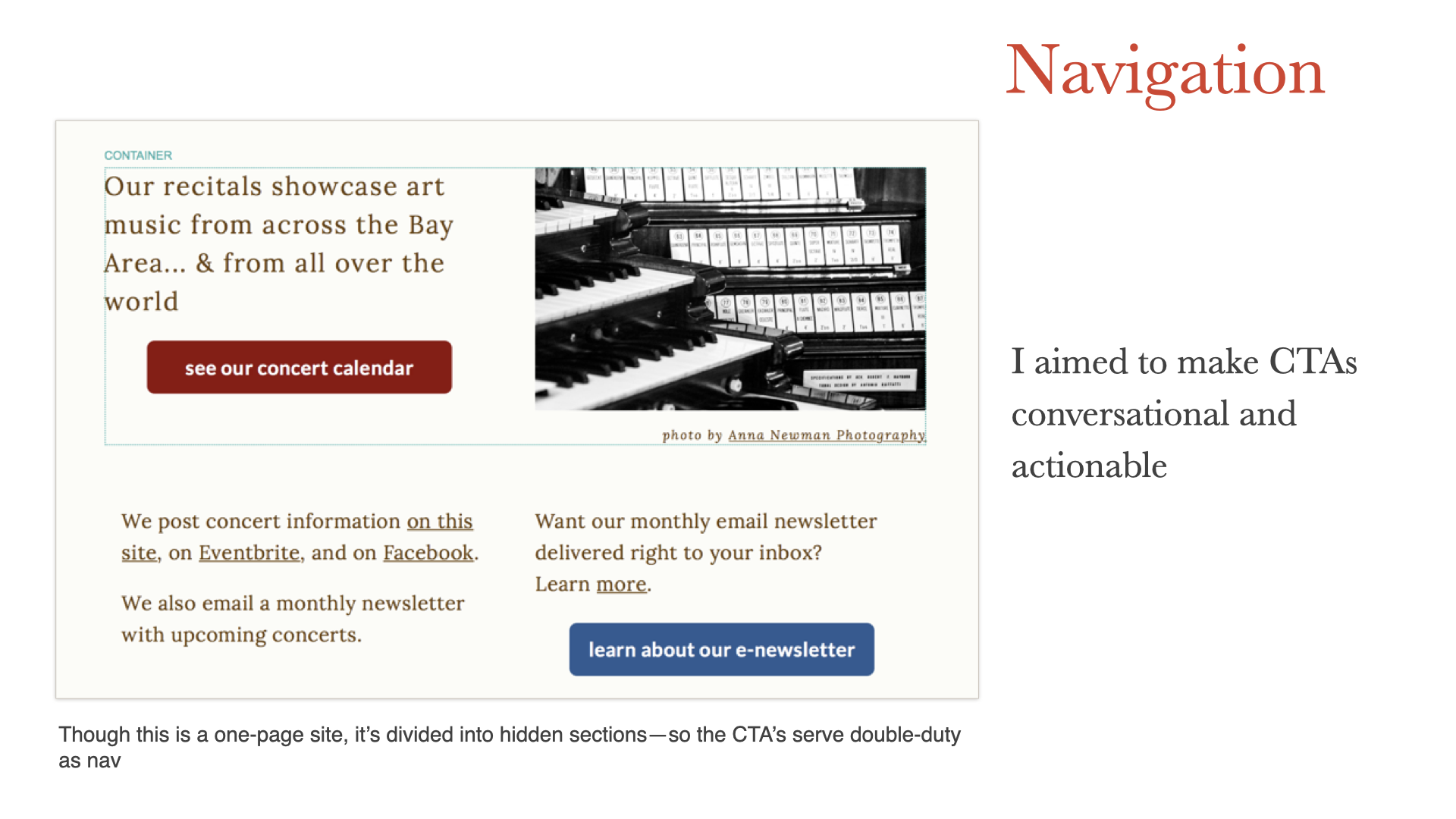
• Conversational CTAs doubling as navigation
• Eventbrite ticketing integration
• MailChimp newsletter sign-up
(a shift from staff using personal email)
See the Process
This gallery offers a quick overview of the project — from identifying the Cathedral’s website issues to designing a fast, maintainable one-page solution. Each slide highlights a step in the process and the decisions behind it.
Focus and clarity—not heavy resources—kept this program connected.
Practical content design builds bridges between people and programs.